


What Makes Star Wars and Star Trek so Great, Part V
Prequel Designs

As I discussed in Part 2, Star Wars and Star Trek before it each offer superbly designed spaceships and interesting and advanced tools used alike by the heroes and villains. However, they have since fallen from the lofty heights of their best days.
Getting straight to the point—in my view, ships that are introduced in “prequel” space fantasies are never as good as the original designs. In review, these are ships appearing in later movies of a successful franchise, though set at an earlier time than the original, starting movie. The featured ships must then predate the ships from the original ones we know, and as such, they need to have design cues that harken us to the “later” model.
I understand that this is a format-imposed handicap in that the original ship is the default one by which we measure the design; however, I cannot think of one prequel ship that surpasses the original one, with one possible exception that I will explore below.
Star Trek
For the sake of scope, I will focus on the Federation (and pre-Federation) ships in Star Trek. These prequel ships generally do not compare favorably to the original Enterprise. The NX-O1 from Star Trek: Enterprise is, let’s be frank, kind of ugly. Again, I realize this is a prequel-imposed issue as this ship should look more primitive than the original. But still.
However, I need to stop right there. Don’t get the impression that I believe that only space ships that are beautiful or handsome to behold are well-designed ships. This is not the case. I can think of two off-franchise examples right off the bat that demonstrate the contrary. The first is the Battlestar Galactica, which is not pretty, but is sublimely powerful-looking. She resembles a gigantic alligator in space. Or perhaps Godzilla. Another example is the USCSS Nostromo from Alien. She’s a star-freighter towing an enormous ore refinery. Dark and gloomy, and strictly utilitarian in design, she’s the perfect setting for a horror movie set in space.
Thus, the same could be said about the NX-01 Enterprise. She’s supposed to be the first, the pioneering ship that Earth has sent into deep space—she would need to be a little rougher around the edges. For the context of the show—she’s designed effectively. That said, take all that context away, letting her stand by herself in effect, she wouldn’t be on the top of anyone’s list of favorite looking ships.
As another and even better example of a bad prequel ship design, I give you the titular ship from Star Trek: Discovery. She is strikingly awful looking and with questionable functionality. Also with the same design ques that harken back to the original Enterprise, there’s a two-part saucer section with a small saucer embedded, yet separated from, a larger, circular section around it. The function of this separation, which creates an obvious inability to travel easily between the two sections, is not self-explanatory. (Perhaps it is meant to contain battle damage? It may be explored at some point on one of the episodes. I wouldn’t know having never seen anything beyond the first episode.) The ship’s back end and engines look as if someone drove a steamroller over the back end of the original Enterprise to flatten it out. It just doesn’t compare well to the original at all. Enough said there.
However, the Enterprise from Star Trek: Strange New Worlds is actually an exception to my general rule. This ship takes the best features from the original Enterprise and the original cast movie version and combines them together. For example, her engines are back to being cylindrical with the colorful revolving embedded globes in front (like the original), yet there are also blue energy fields down their inside sides like the movie version. Nice combination! The cool triangular engine pylons from the movie Enterprise are back, but with added slits, for visual effect I imagine (as they would likely add no functionality to space travel). The planetary dome at the bottom of the saucer section is lit as it was in the original, and not in the movie version. (It looks better lit!)
I will only ask this. Is the lovely child sprung from the original two’s designs actually better than the originals? Perhaps, but there also needs to be context. The pretty ship needs to be involved with a great crew and have interesting and exciting adventures. That adds something to her mystique. Does that occur in the new series? As a matter of fact, I ask the same of the Discovery as I would very much like to forgive her many design flaws. I cannot answer these questions, not having seen a single episode of either series (minus one). I will have to leave that to your own judgment.
Star Wars
The prequel Star Destroyers that appear in Episode II and III are actually not awful looking, but carrying that prequel handicap, they just don’t compare to the original. The problem, just as with Star Trek: Enterprise, is that the designers must in-effect de-evolve a ship to a less mature-looking design.
In this case, the sides of Star Destroyers in Episode III, instead of being straight lines, now have indentations. Instead of ball-shaped projections on their rear tower, they have bar-shaped ones. The problem here is that changes just appear to be made just to show a difference, not a real, functional difference. At least with the NX01-Enterprise, there is a contextual reason for a more primitive feel—not just a different look.
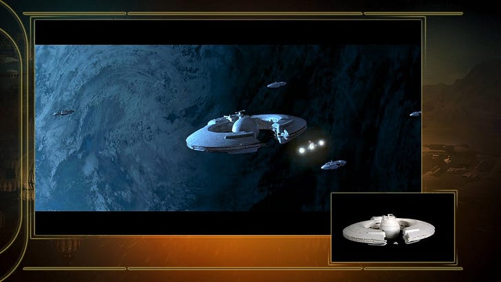
However, the ships introduced new in prequel movies, such as the Trade Federation Battleships we see in Episode I, have no prequel-imposed limitations. As never-seen-before vessels, their designers could take the design to creative heights and it shows. To great effect, the ships feature an imposing center globe section that is encircled by rounded arms the nearly meet in front. In this way, I’m quite sure, they intentionally foreshadow the Death Star.
Moving to small fighters, the Jedi Interceptors as seen in Episode III are nearly an exception to my prequel rule as they are cool-looking ships. These are the forerunners of the TIE Fighters and, thus, must have certain design ques that harken back to the original. And that, in my opinion, makes for the worst visual feature of the ship—its cockpit canopy. It is otherwise cool and sleek with two slightly downward sloping wings and nose projections. In an allusion to the X-Wing, its wingtips feature flip-up and down flaps when the ship engages in battle. Yet, unlike the X-Wing, these don’t seem to have any functional reason for being there. At least with the X-Wing, one could argue that it was helpful to have its guns and engines further separated during a battle in order to avoid the spread of battle damage.
To point: Jedi Interceptor’s center section, the cockpit, would look so much better with a more protruded, rounded front edge, but instead it is a flattened circle, just like the TIE Fighter. What works for the TIE Fighter, does not work as well here, in my opinion.
And, just like the Trade Federation Battleships, the Naboo ships also have no prequel-imposed design limitations. The sleek fighters, like the Supermarine Spitfire from WWII, offer aesthetically pleasing features in addition to their functional role as killing machines. As such, their fuselages and engine mounts end in long, thin spires. No design cue from a previous ship is needed.
Another example of a good ship design is introduced in a Star Wars prequel, Episode II, is the Republic Gun Ship. With no other corresponding vehicle in the original trilogy, its design also has no format-imposed handicaps. These are the futuristic helicopters of the Republic—with gun-platform wings that ominously reflect a Soviet-era gunship, the Hind. On the other hand, the diminutive, more dog-like imperial walkers in Episode II and III, very much have the prequel handicap. Their grandchild, the taller, more elephantine AT-AT, first seen in Episode 5, are so much grander in appearance.
I could go on further, but I think I’ve made my point that prequel designs have not improved upon the original starship designs, but are generally hampered by having design styles that need to harken back to the original design. There are some exceptions, as I mentioned above. For example, I do believe that the Vulture Droid fighters from Episodes I and III, which have design cues from the TIE Interceptors of Episode VI, are actually pretty nifty.
I believe these prequel designs serve as a good contrast to the great sequel designs of both franchises. With that idea in mind, next time, I want to get further into these franchises’ “bad guy” ships that simply are not worthy advisories to the good guys. While they may be designed to look powerful and menacing, they just don’t provide a match-up that makes the show or movie memorable.
In other words, their bad designs helped diminish the movie and the story being told.
See you next time!